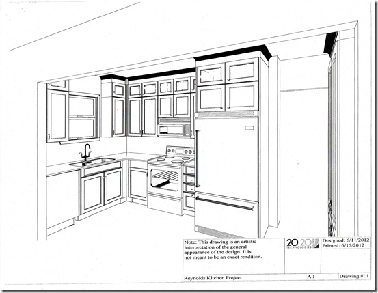
Pam Vernon, Classic Kitchens in Leawood, KS, didn’t waste any time coming up with a plan. She eliminates the tight U space in front of the sink by pushing the dishwasher all the way back to the wall. Counter space expands when the refrigerator changes places with the range. A counter –depth side by side refrigerator gives more room to maneuver.
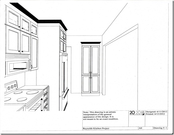
Cabinets go to the ceiling and a built-in cupboard to the left of the doorway keeps appliances close but hidden. Trays and platters stand upright in the cupboard above the refrigerator. A rectangular counter-high butcher block table multi-tasks as a work surface and a dining spot in the nook.
A swing out shelf close to the stove makes use of the lower space in the corner. The top cabinets have glass fronts and inside lights. The microwave has a range hood and the range has an electric induction cooktop and a convection oven. All of the appliances are stainless steel.
The sink is a double basin white porcelain model and there’s glazed white subway tile on the wall. There are under-cabinet lights, canister recessed lights, a light over the sink, a ceiling light and lights in the eating nook and in the hall. Right, there is no such thing as too much light in a kitchen.
Wowsa. It was exactly what I had in mind. Oh, and the trash – two skinny stainless steel containers fit nicely up against the wall.


WOW!! Cant wait to see it. Although i’m kinda like Sig and want to stay the hell away till it’s finished.
Wow, I hadn’t seen this before — the design is not only beautiful, but uses every nook and cranny and sliver of space in your kitchen. I’lll make a trip to Kansas City to see this! What the ETA?
Got counters and sink in today, we decided to make a major change and take out wall between hall to side door — even tho it is all framed in and ready to go. Lynn, our contractor, says that is why they call it build..and design. It’s probably three weeks out — in the meantime, Lynn is building shelves on the way to the basement. Which is a Very good thing!